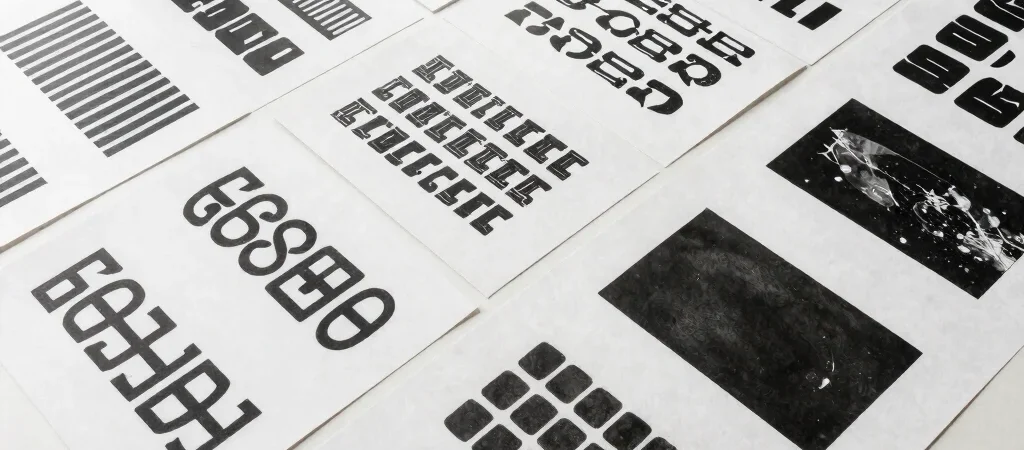
Bespoke display typography serves as a primary signature for a typographic identity. Rather than applying superficial decoration, custom letterforms communicate personality through stroke contrast, aperture, and rhythm.
Signatures Built from Singular Letterforms
A well-crafted wordmark relies on a few distinct typographic decisions rather than novel quirks. Modifying stem weight or drawing unique terminal shapes creates instant recognition. When done with restraint, custom type anchors an identity system across diverse applications.
Reducing Visual Noise to Highlight Message
Identity systems suffer when overcrowded with secondary graphic marks and excessive colors. Establishing a dominant display typeface allows all graphic communication to speak with unified tone. The clarity of the letterform carries the visual weight without requiring supporting embellishments.
Scaling Across Analog and Digital Interfaces
Display type must perform equally well debossed on matte paper or rendered on high-density screens. Testing kerning pairs and optical sizes early ensures legibility remains uncompromised across mediums. Rigorous testing during drawing yields a identity system that endures.