Category: Graphic Design

  • Personal Symbols

    Personal Symbols

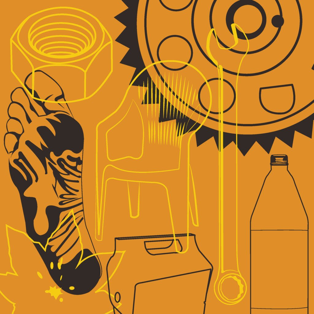
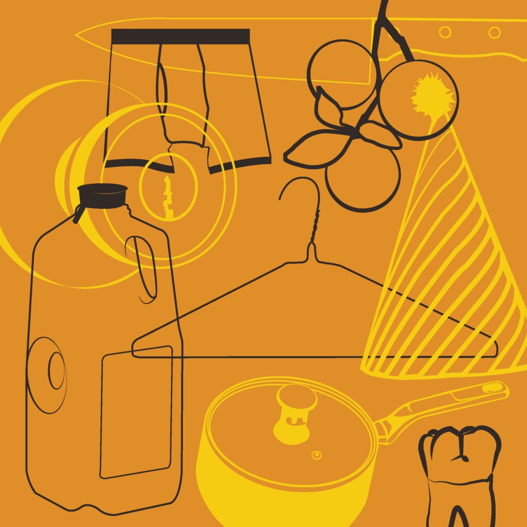
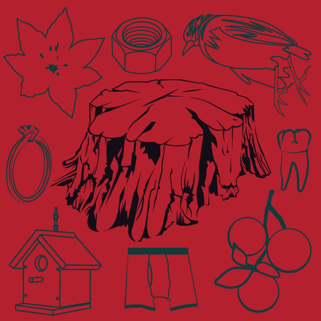
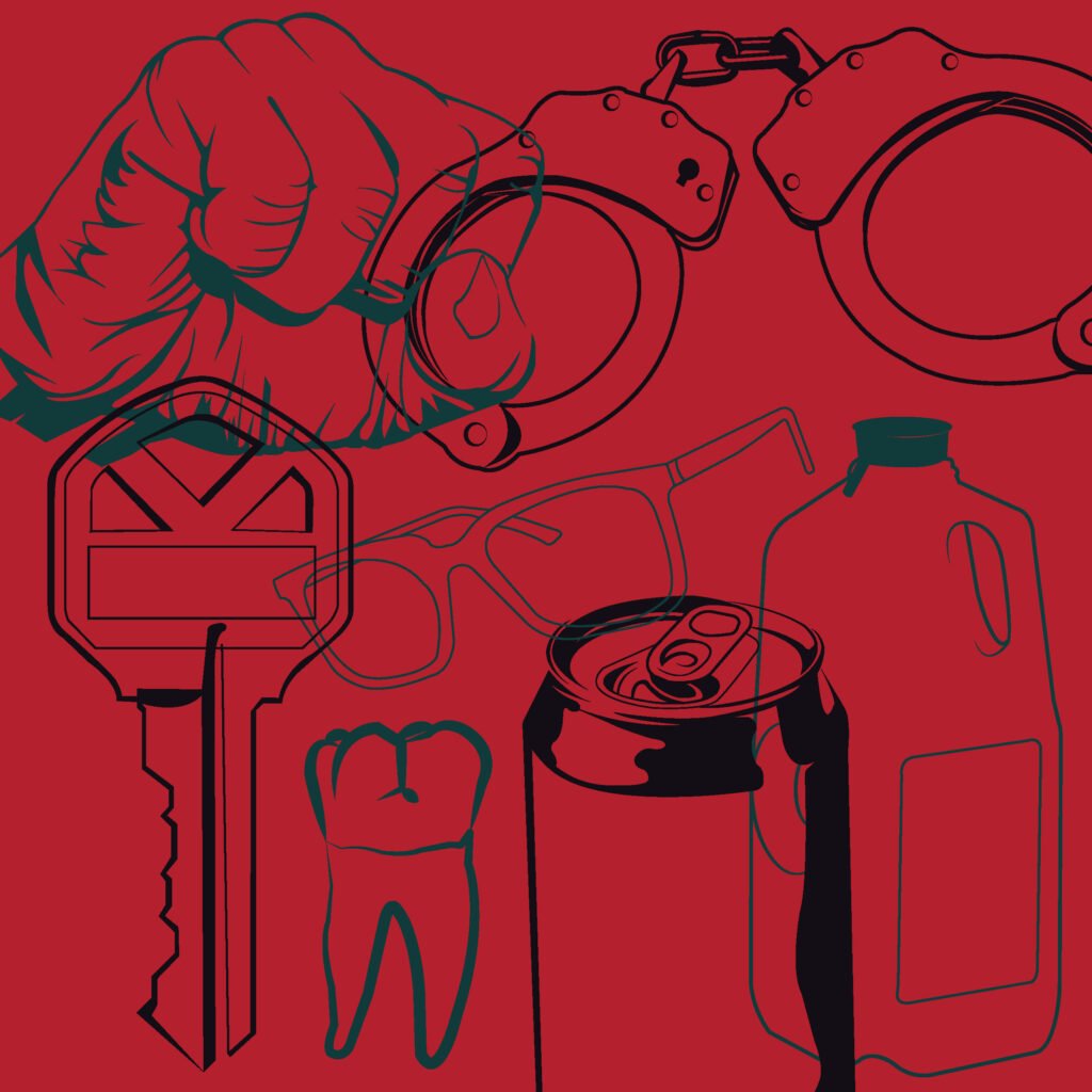
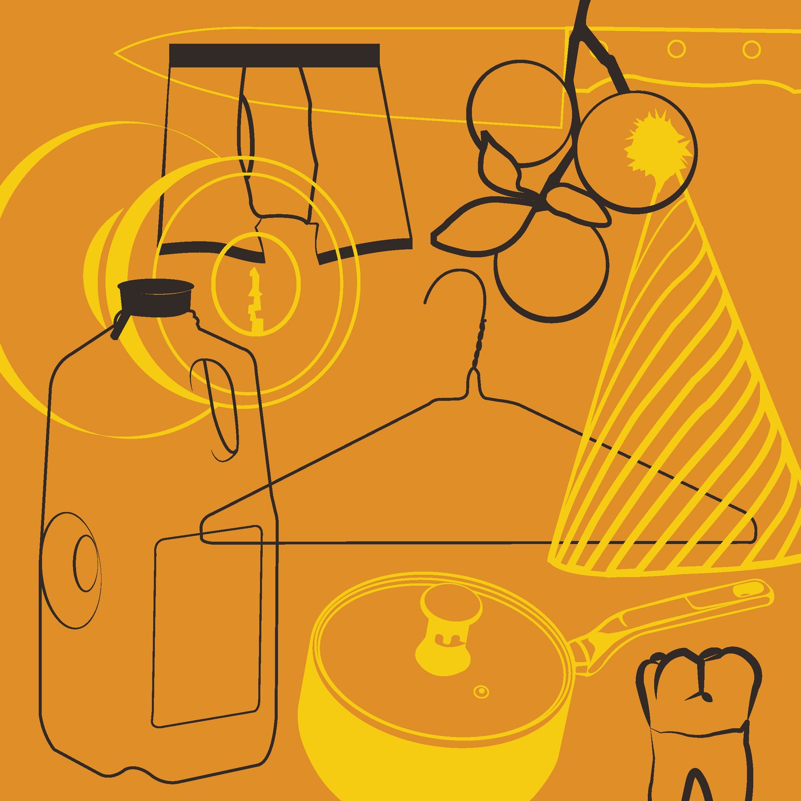
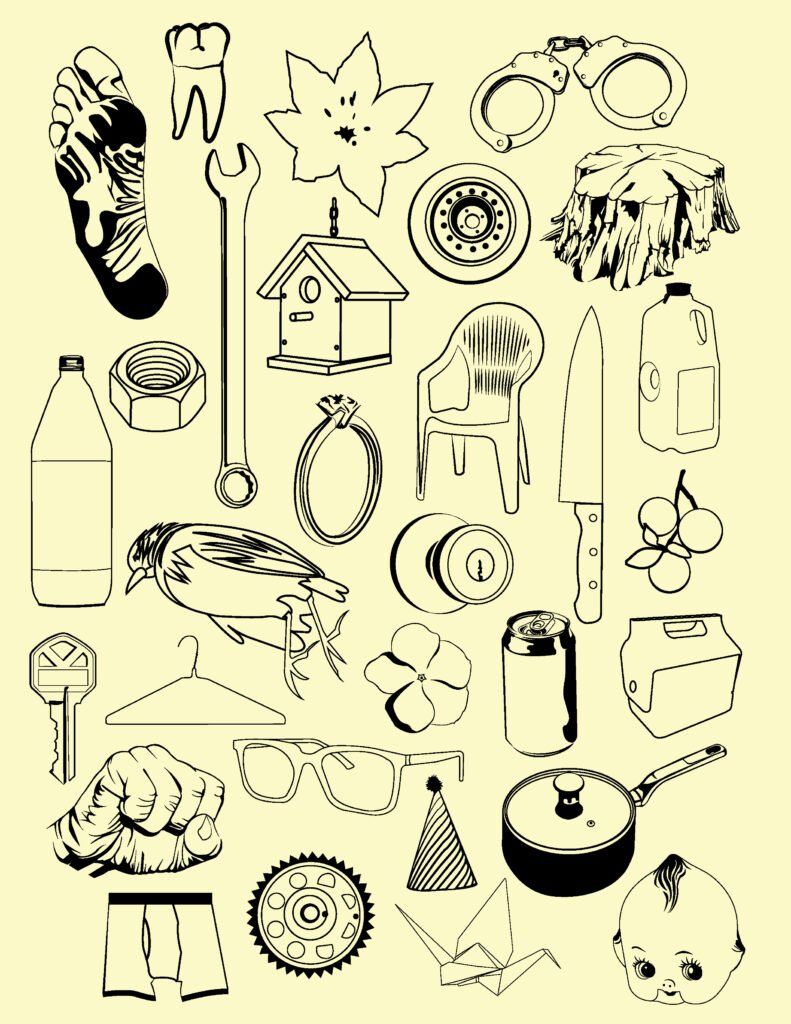
    The objective of this project was to create a collection of at least 24 personal symbols drawn from everyday life, memories, and meaningful objects. Originally conceived as an icon-making exercise, the project gradually evolved toward a more illustrative approach. I found myself gravitating toward recognizable objects and forms, while maintaining the reductive visual language of icons and logos. Each illustration was intentionally simplified, stripping away unnecessary details to capture the essential characteristics of its subject.

    The symbols primarily represent personal memories, but also include objects that hold significance for various reasons. Each one serves as a visual trigger, bringing to mind a specific memory or a collection of associations. When brought together, these objects can form compositions that tell stories through their universally recognizable qualities, their personal meanings, or a combination of both.

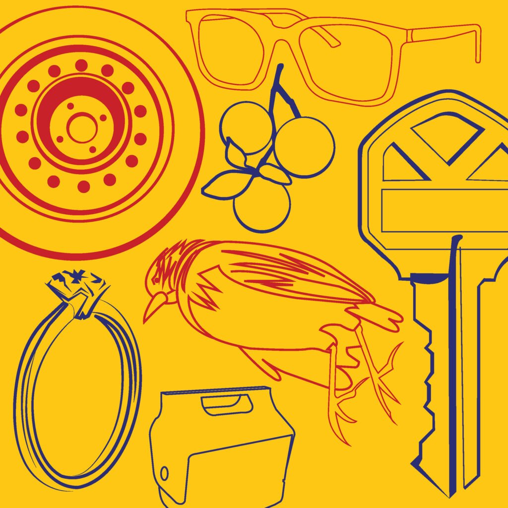
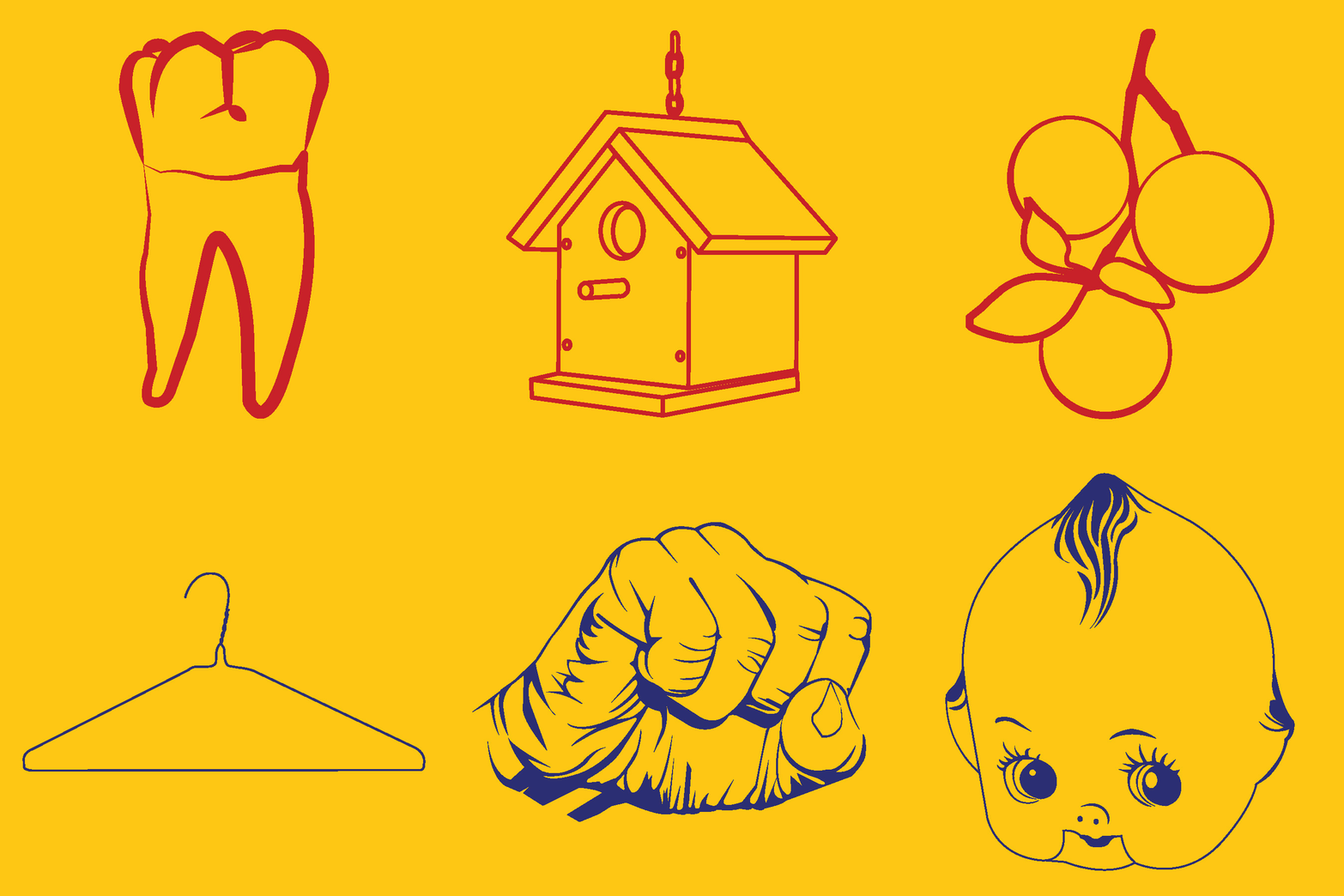
    After developing the individual illustrations, I created several compositions to explore how the symbols might interact and create meaning through juxtaposition. The collection’s emphasis on familiar, everyday objects naturally brought Pop Art to mind, an influence I further explored through a series of color studies.

    I may continue to develop this collection through future investigations, exploring new ways to arrange, reinterpret, and expand the visual language of these forms. The project also reminded me of the challenges involved in reducing recognizable objects to their most essential visual elements. While the resulting illustrations may fall somewhere between icons and traditional illustration, I am pleased with their simplified, graphic qualities, their Pop Art sensibilities, and the overall direction of the project.
  • Tek Tek Typeface

    Tek Tek Typeface

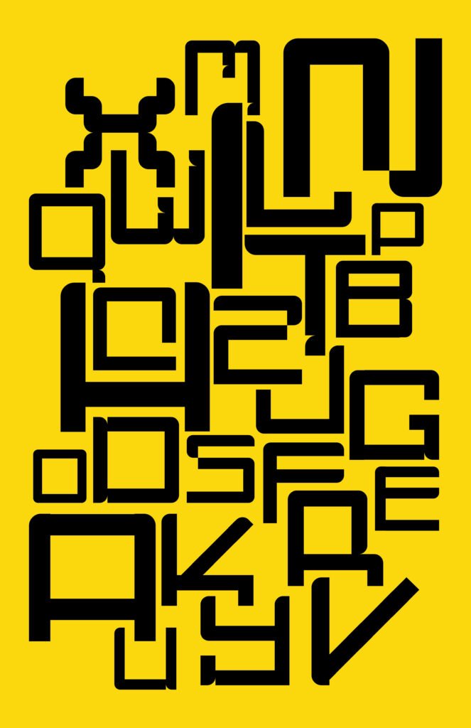
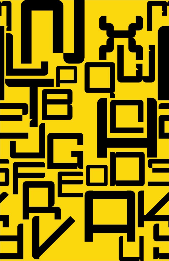
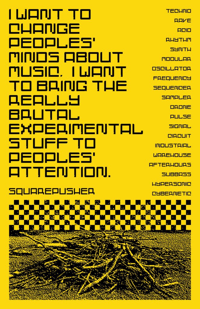
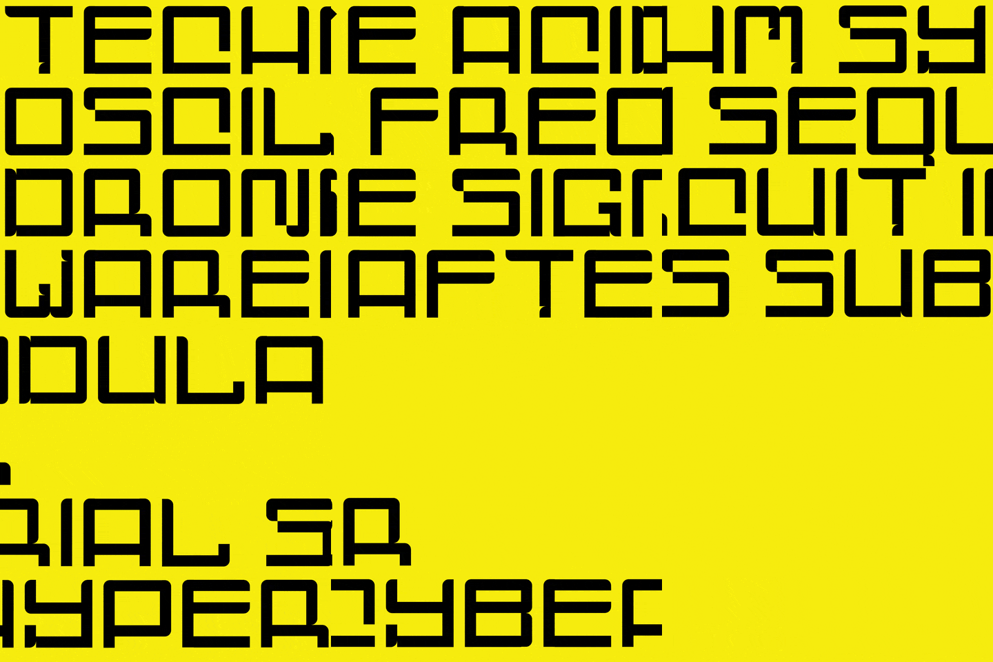
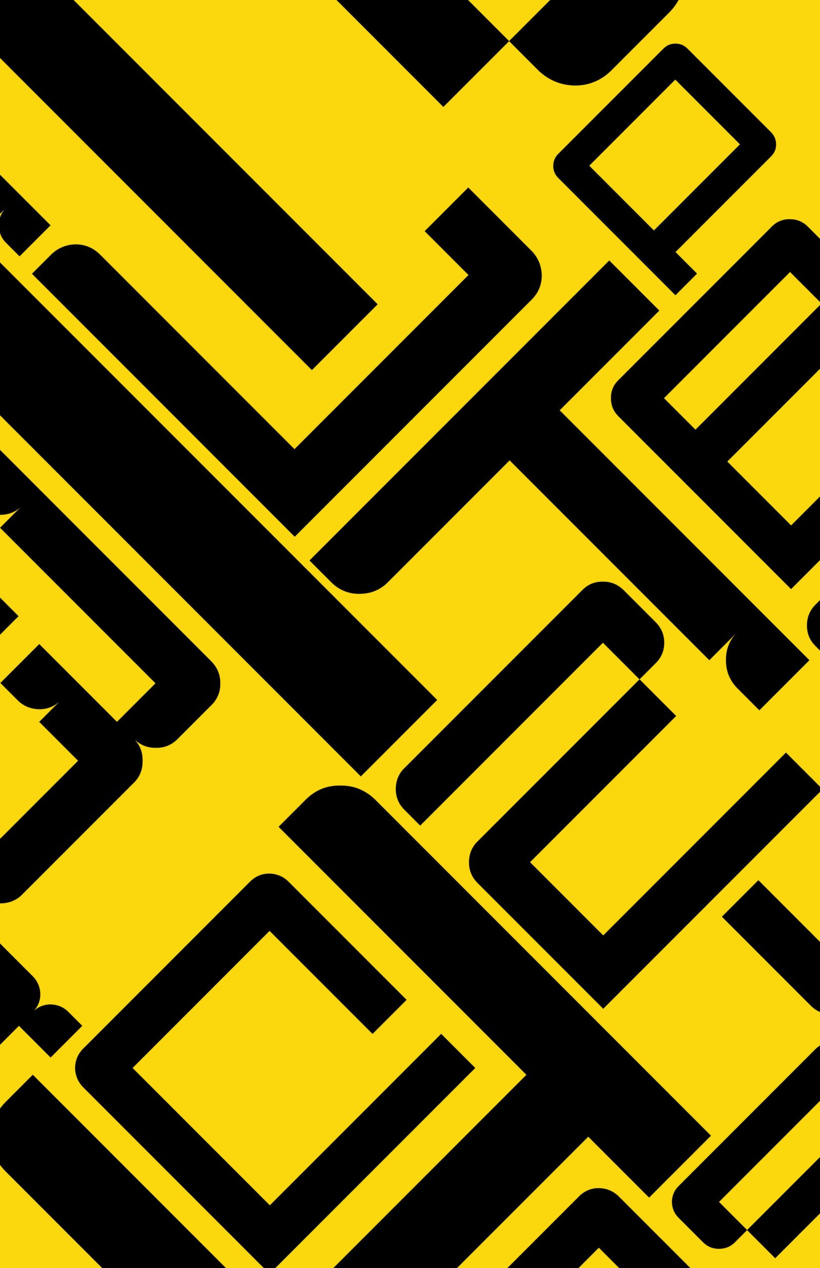
    Tek Tek is a monospaced display typeface with a single proportional exception: the letter I. Built on a consistent grid, its letterforms maintain uniform stroke weights, with select vertical strokes breaking the grid to create subtle variations. Inspired by both futurism and retrofuturism, Tek Tek combines boxy geometric forms with low-profile curves and occasional cut-ins. These angular slashes introduce rhythm and character into the otherwise uniform structure. The design draws inspiration from rave flyers, science fiction book covers, and spaceport signage, blending geometric form with a futurist personality.

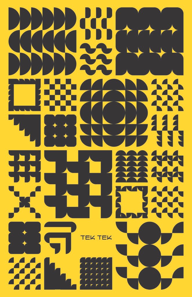
    Tek Tek is an uppercase-only display typeface with a collection of abstract geometric glyphs in place of lowercase letters. Constructed from the same geometric principles as the typeface, these forms function as icons, decorative elements, and can be used to create patterns. This accompanying library of graphics is intended to streamline the design process, allowing designers to quickly develop compositions with forms that complement the typeface. Tek Tek is suited for a range of applications, from rave flyers and electronic music artwork to branding and experimental graphic design, particularly projects that aim for futuristic and retrofuturistic aesthetics.

    Download Tek Tek Here

  • Mark Making: Form, Texture, Color, and Scale

    Mark Making: Form, Texture, Color, and Scale

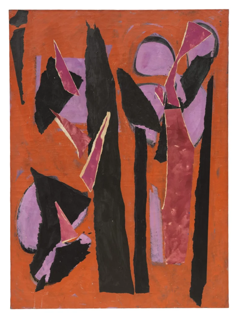
    We get used to a certain kind of colour of form or format, and it’s acceptable. And to puncture that is sticking your neck out a bit. And then pretty soon, that’s very acceptable.

    Lee Krasner


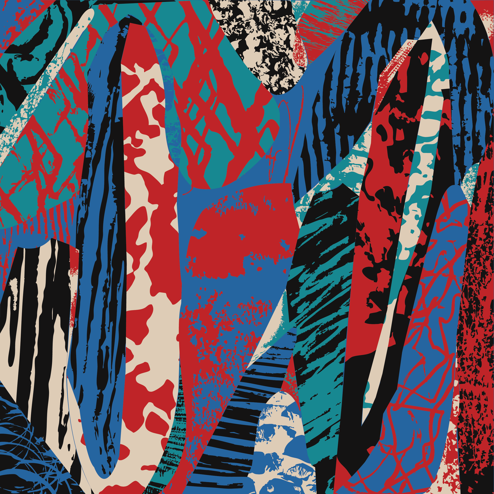
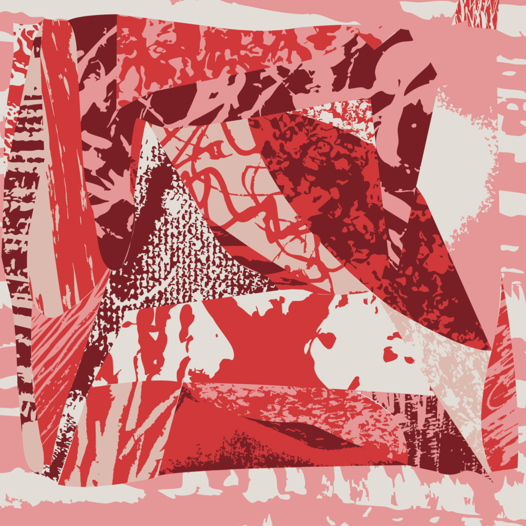
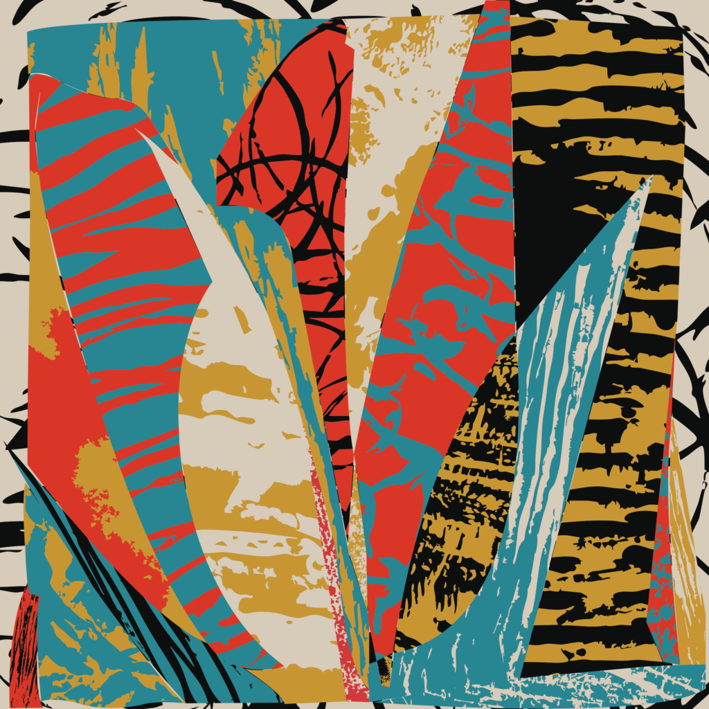
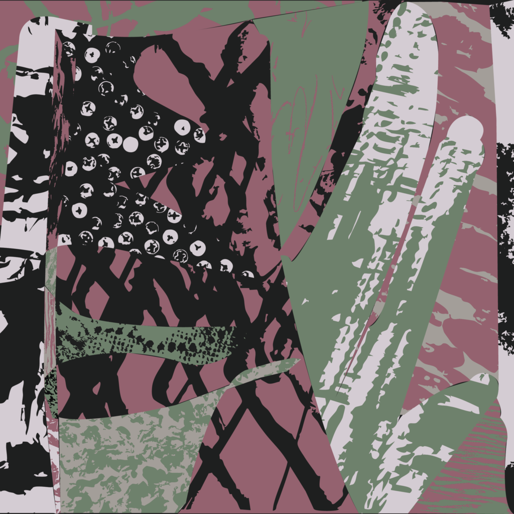
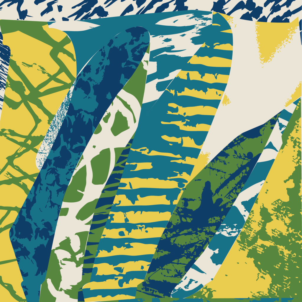
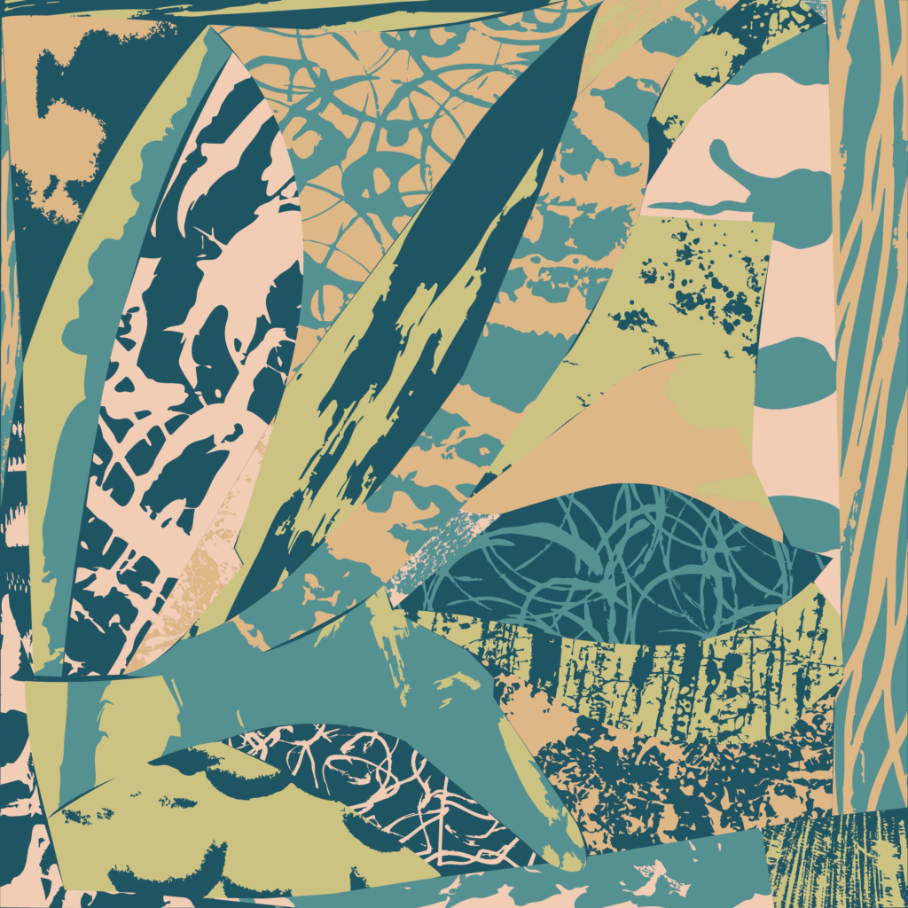
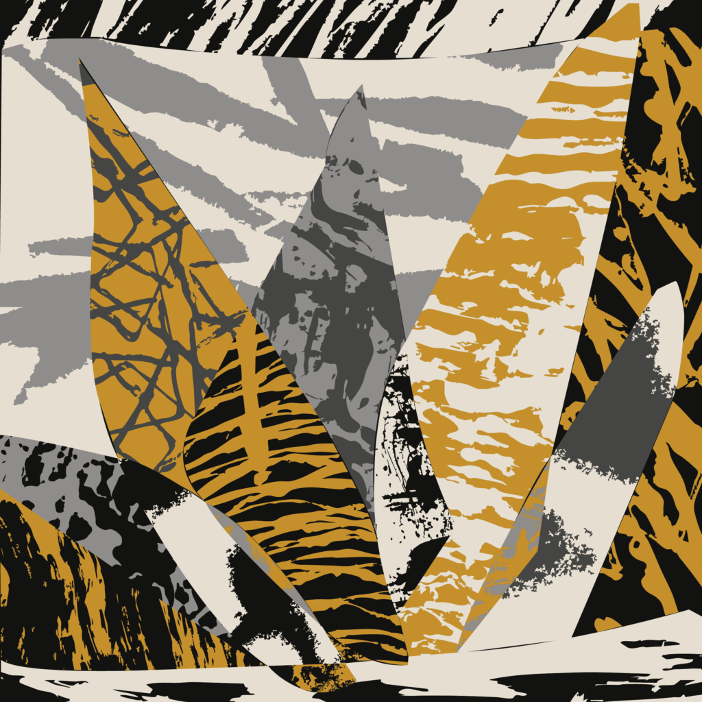
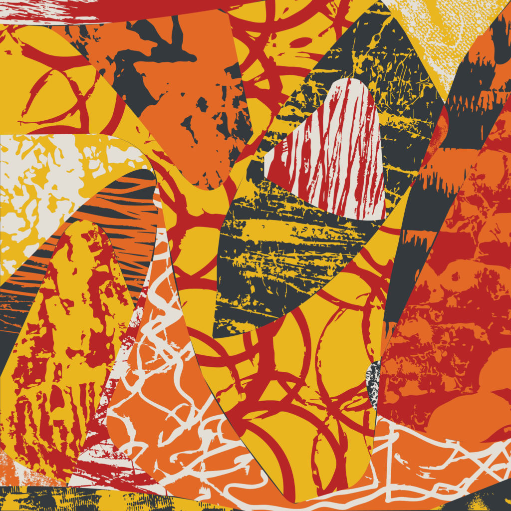
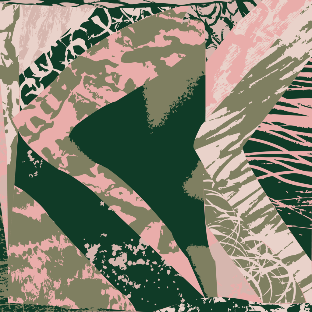
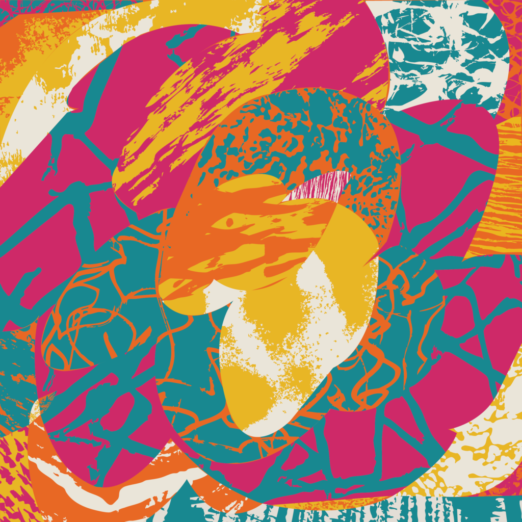
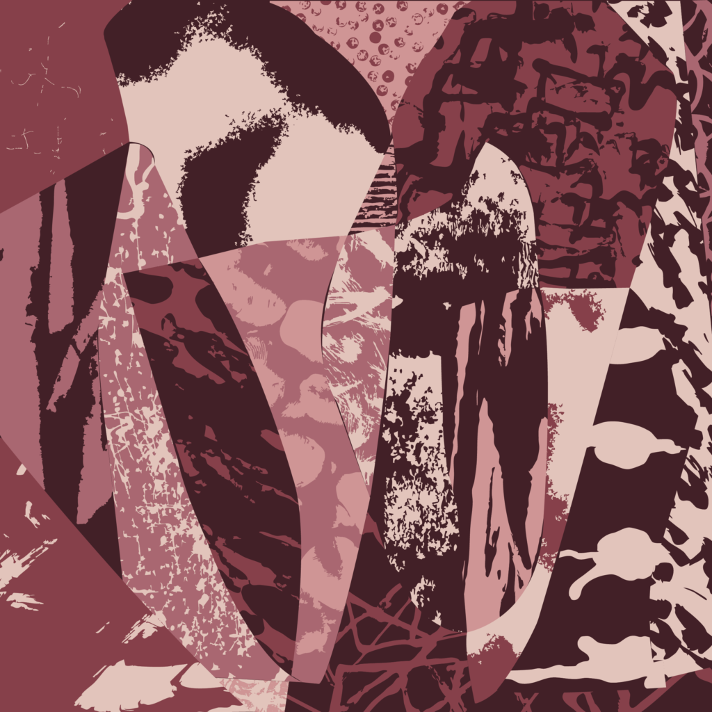
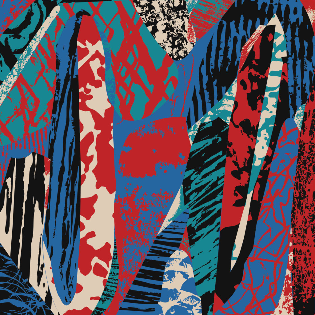
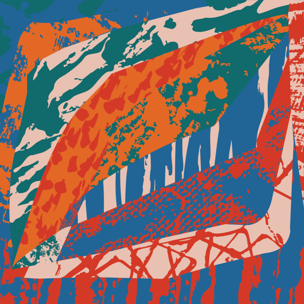
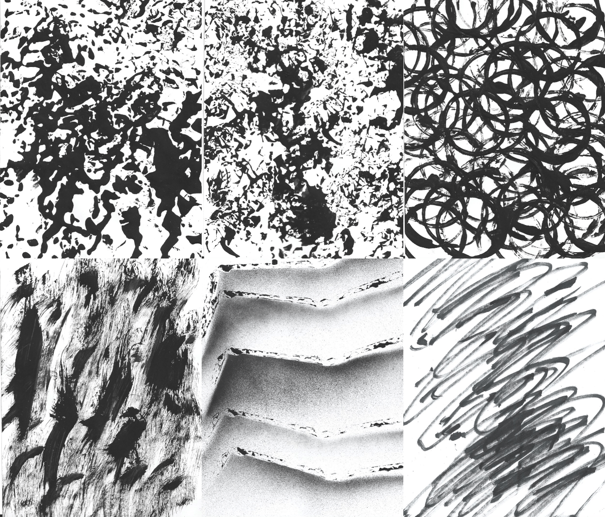
    I began this project as a way to return to art-making and explore mark-making without a predetermined outcome. Inspired by an early exercise from design school, I created 100 black-and-white studies, avoiding recognizable forms and lettering. Using acrylic paint, spray paint, markers, pencils, and found objects, I experimented with different textures and gestures. One of my favorite techniques involved stamping cardboard edges to create thick, repetitive lines that became prominent in the final compositions.

    Next, I sketched approximately 50 thumbnail compositions and selected 12 to develop digitally. Approaching each composition as a mosaic, I divided the space into shapes and filled them with marks from my collection, exploring how different textures could complement or contrast with one another. I scanned and converted the studies into vectors, then introduced limited five-color palettes inspired by Expressionist artists. Color became more than a decorative element; it altered the relationships between forms, sometimes reinforcing boundaries and sometimes dissolving them.

    The most significant discovery was the influence of scale. When enlarged, small marks took on an expressive, gestural quality, suggesting movements made with the entire body rather than the hand alone. Working with vector graphics further expanded this exploration, prompting me to consider how scale influences a viewer’s interpretation of a mark.

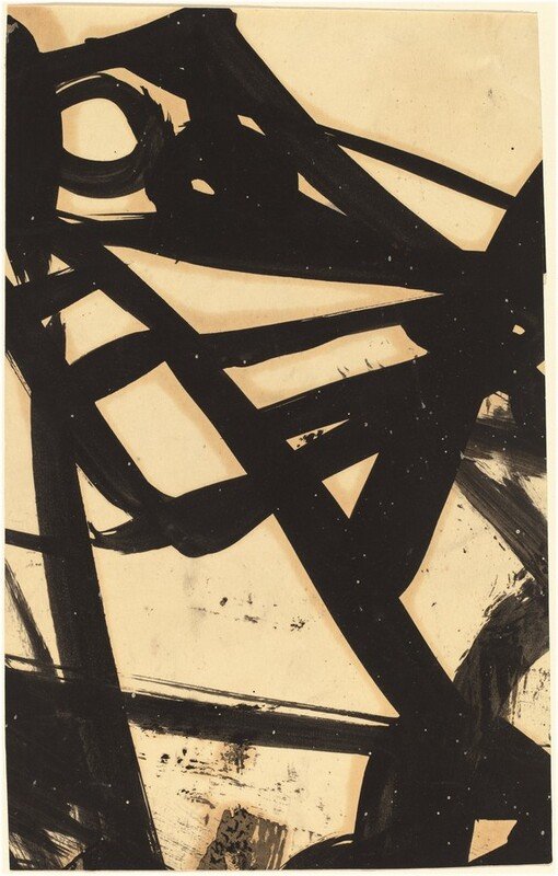
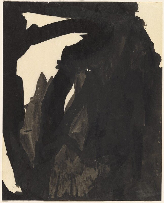
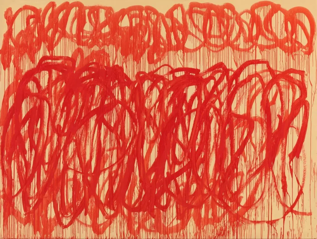
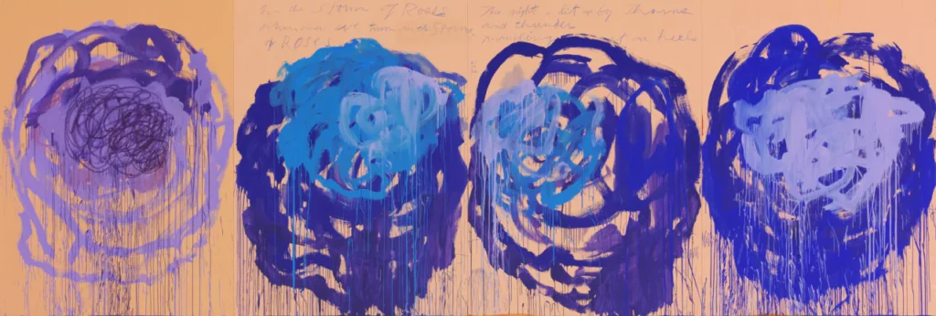
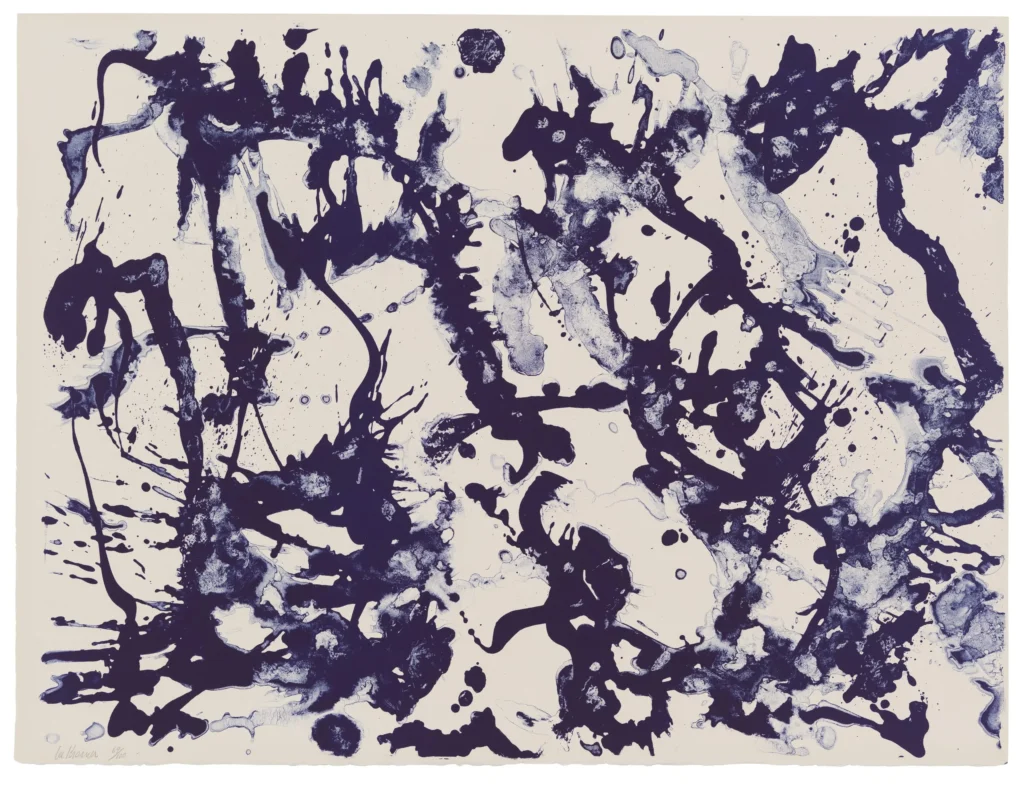
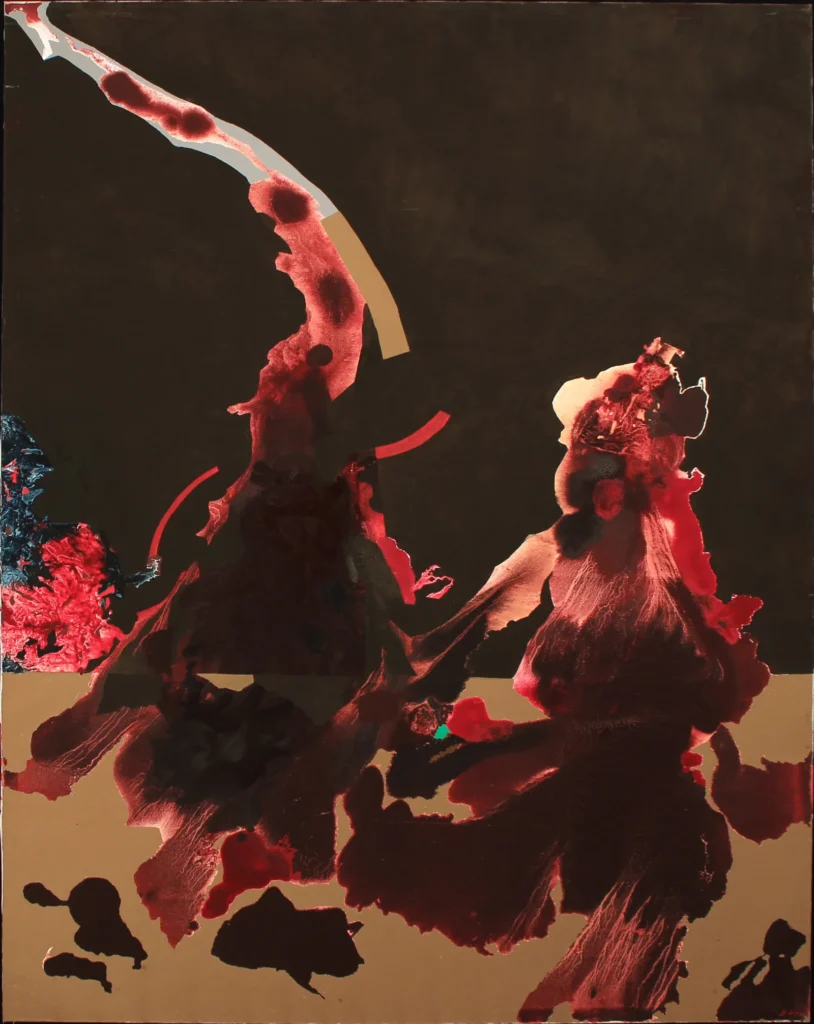
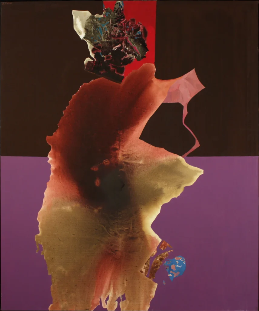
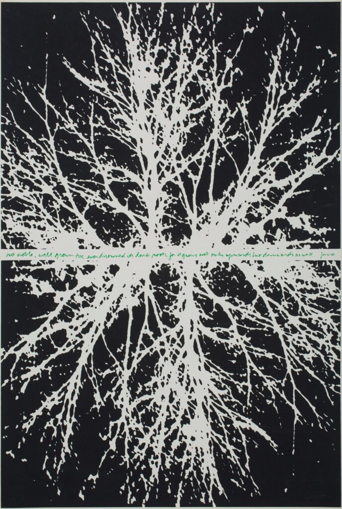
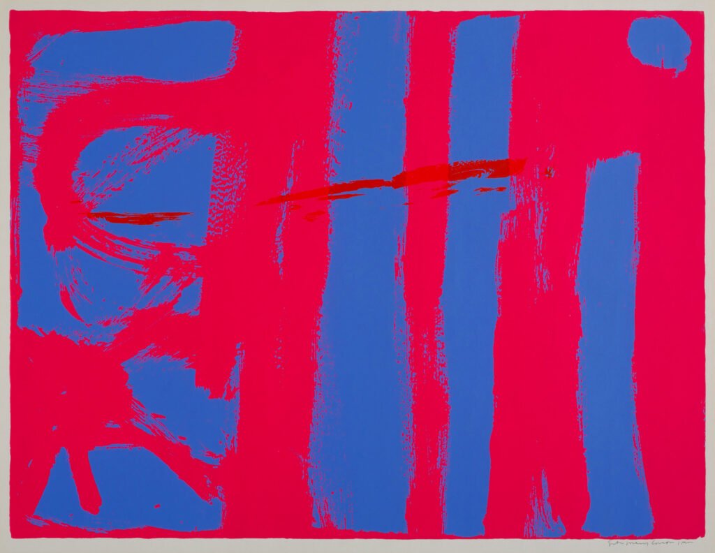
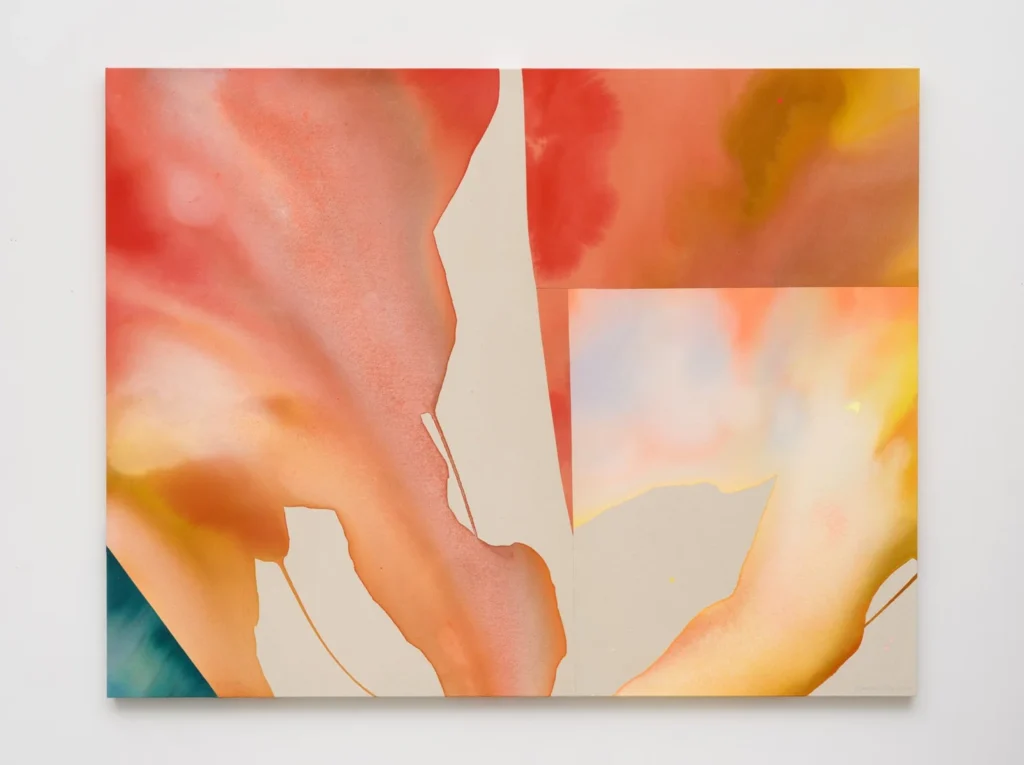
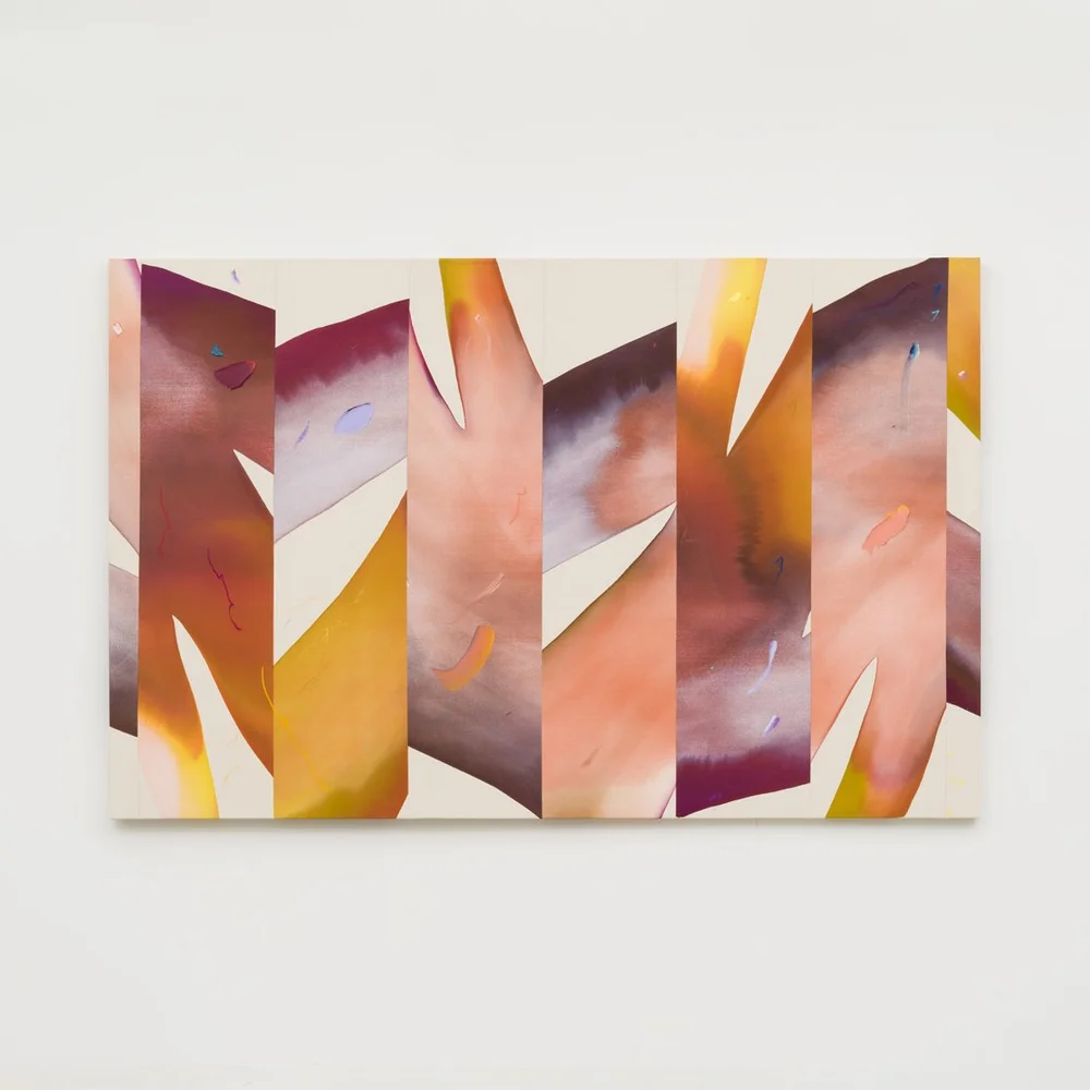
    The resulting compositions investigate the relationships between gesture, form, texture, and color. Influenced by Franz Kline, Cy Twombly, Lee Krasner, Dorothy Hood, Corita Kent, and Heather Day, the project evolved from a simple exercise into an exploration of how marks transform through arrangement, color, and scale.

    If you want to download the texture library I used for this exercise click on the texture gif above.


    I chose the works of Franz Kline, Cy Twombly, Lee Krasner, Dorothy Hood, Corita Kent, and Heather Day for inspiration for their distinct approaches to expressive mark-making, abstraction, and color. Their work provided inspiration for exploring how gesture, texture, and color can interact to create dynamic compositions that balance spontaneity with intentional structure.